The Pantone Color 2019
Thus, this year’s color by Pantone is Living Coral. It is inspired on the beauty and vibrancy of the gorgeous sea coral reefs, with its amazing textures, warmth and resistance.
These are all inspirational features the color transpires in any type of design it’s used!
As a joyful color, it will lighten up any design in which is used. In Interior Design and Decor, Living Color can be used in many ways.
Let’s check some ambiences with Living Coral!
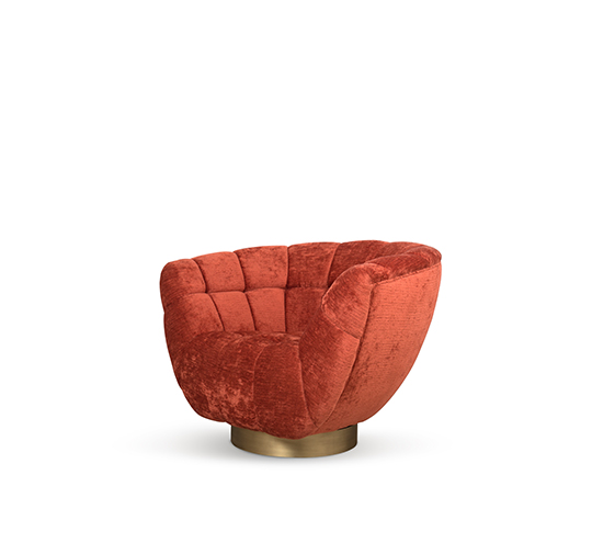
Accessories are a great way to use Living Coral. Adding color and texture through pillows, throws or rugs is an understated way of using bold colors.
Furniture items can also be Living Coral painted. They will add more color to an ambience and set the mood of the room. Bold colors in bigger amounts can also make a statement.


Having Living Coral color as the background is another way to use it, having one wall painted and others neutrals for contrast. Even if not as wall paint, you can have it as wallpaper.
As a bold color itself, Living Coral can still be easily combined with several other colors, some neutral and others equally bold.
Pantone Color 2019 – Color Combinations
Inspired? Read more at Insplosion.
Editor’s Choice: